Quarterly Update: The Economic Downturn in Historical Context
- Dinah WalkerAnalyst, Geoeconomics
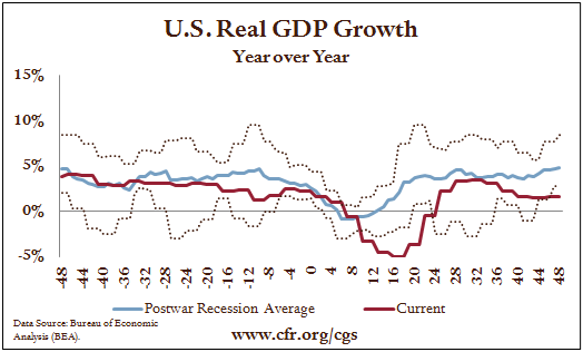
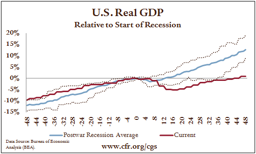
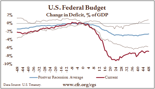
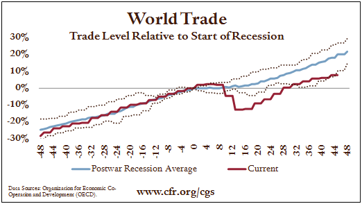
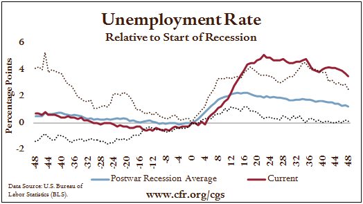
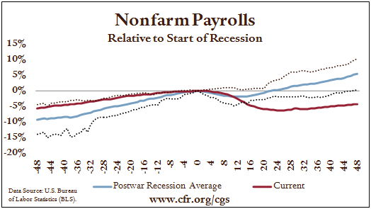
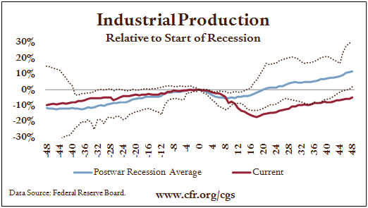
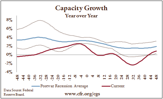
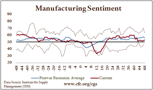
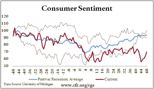
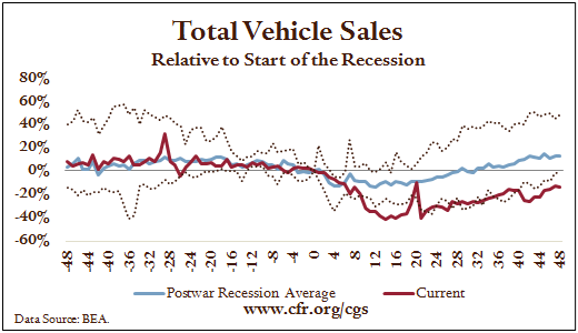
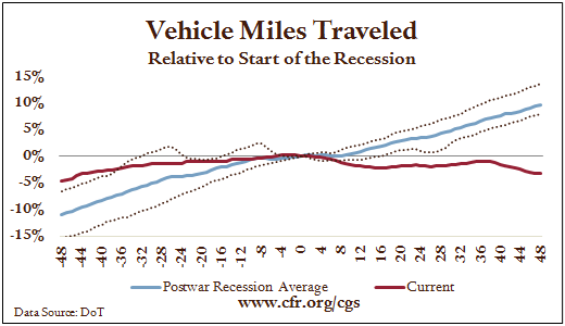
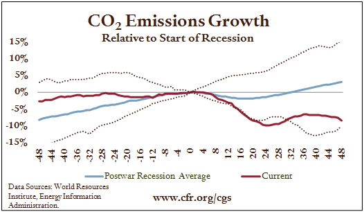
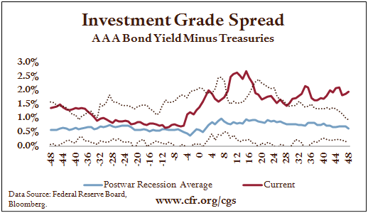
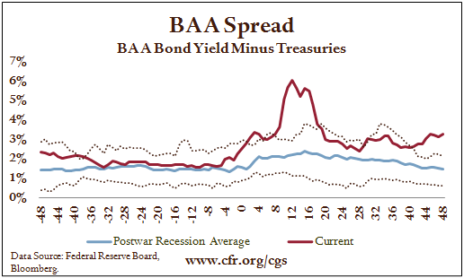
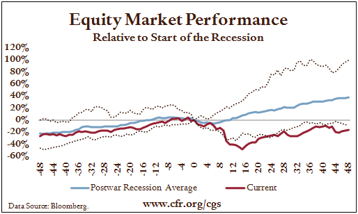
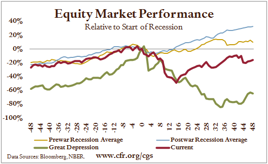
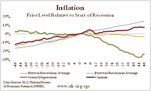
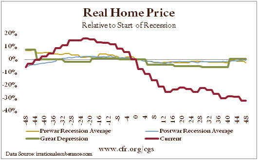
How do the recent economic collapse and recovery match up with past cycles? This chart book provides a series of answers, plotting current indicators (in red) against the average of all post–World War II recessions (in blue). To facilitate comparisons, the data are centered on the beginning of the recession (marked by “0”). The dotted lines are composites representing the mildest and the most severe experiences in past cycles. Because the most recent downturn has been compared to the Great Depression, the appendix plots the recent trend lines against the 1930s.
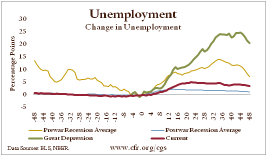
December 2011 marked the fourth anniversary of the start of the most recent recession. It is now possible to say with certainty that this was the worst downturn of the postwar period when measured by a variety of indicators. The economy contracted more and took longer to recover. Forty-eight months after the start of the recession, unemployment was still 3.5 percentage points higher than at the start of the downturn. This chart book was designed to compare the four years immediately preceding and following the start of postwar recessions, so this will be its final update. The ongoing progress of the recovery will be tracked in the recovery chart book, which can be found here and which compares the recent recovery to prior postwar recoveries.
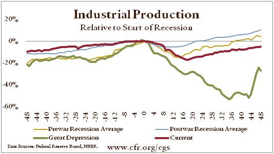
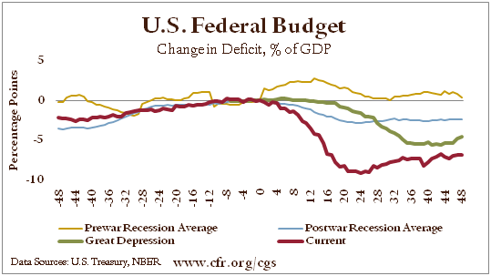
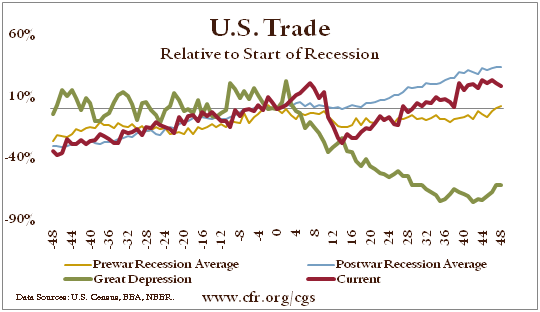
Appendix: The Current Recession Compared to the Prewar Average and the Great Depression
The economic cycle framework can be used to compare the current cycle to prewar (World War II) recessions and the Great Depression. The thick red line represents the current recession; the thin blue line, the postwar average; the thick green line, the Great Depression; and the thin gold line, the prewar average.
Explore Our Other Chart Books
 Report
 Report
 Report
 Report
 Report
 Report