Graphing the Pandemic Economy
In a fast-evolving crisis like a pandemic, GDP and other conventional economic metrics are simply too slow to be useful for policymakers who need to make decisions about when to lock down and reopen parts of the economy. Fortunately, real-time mobility data has opened a window into the world that COVID-19 has wrought.
Originally published at Project Syndicate
By experts and staff
- Published
 A. Michael SpenceCFR ExpertDistinguished Visiting Fellow
- Chen LongDirector of Luohan Academy
HANGZHOU/MILAN – COVID-19 is an unprecedented challenge for human society and the global economy. The pandemic has already taken more than 360,000 lives worldwide, and inflicted massive negative shocks on incomes, output, and employment. The challenge for policymakers is to strike a proper balance between containing the virus and creating the conditions for economic recovery.
That is no easy task. While key measures such as testing, contact tracing, and social distancing happen to align well with both overarching goals, measuring real-time progress in each dimension is difficult. Direct measures like GDP tend to arrive with a significant lag, which makes it harder to determine when to reopen various economic sectors and activities.
The Mobility Window
Fortunately, there is an immediately observable, high-frequency indicator of COVID-19’s economic impact: mobility data, which can serve as a proxy for the broader contraction in economic activity around the globe. Following this insight, we have calculated mobility on the basis of aggregated, anonymized data published by Google, Apple, AMAP, and Baidu.
Google, for example, publishes mobility information on retail and recreation, groceries and pharmacies, and workplaces, which we have combined into a single index. Apple publishes mobility data on driving, transit, and walking. And AMAP and Baidu publish location-based services (LBS) mobility data. Most important, these data are updated frequently – either on a weekly or even daily basis.
We have tracked the extent of mobility (as a percentage of its level in normal times) across 131 economies. Google data was the primary source for 129 economies, Apple data for Russia, and AMAP and Baidu data for mainland China.
Among the 19 countries and regions that have announced first-quarter GDP, we find that three-quarters of the variation in GDP growth can be explained by differences in mobility during this period (Figure 1). This variability across countries results from the fact that the virus arrived at different times during the quarter, and triggered mobility responses of varying speed and intensity.
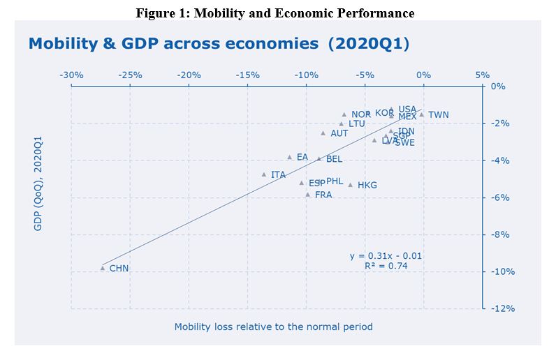
To be sure, mobility is only one indicator of economic contraction. Risk avoidance by individuals, companies, and other institutions also could play a role in depressing economic activity, even in the absence of mandated lockdowns. But as a variable that captures the state of economic activity, mobility has several major advantages.
First, it is one of the few big-data metrics that both captures current activities and is available in more than 130 economies on a daily basis. Second, it is an endogenous variable, in the sense that it reflects both the impact of lockdowns and people’s choices, which often are motivated by risk aversion. And, third, it appears to capture a substantial portion of GDP variation across economies and over time.
Pandemanomics
Though a “pandemic economy” is rather unusual, it has identifiable features and operates according to clear patterns. In the early stages, the outbreak must be contained at the expense of mobility and productive economic activity. Failing that, a recovery cannot be realistically considered.
Owing to the tension between health outcomes and economic goals, the recovery will be much slower than the precipitous economic free fall that occurs when lockdowns are imposed. This general pattern has been confirmed in a wide range of countries (Figure 2).
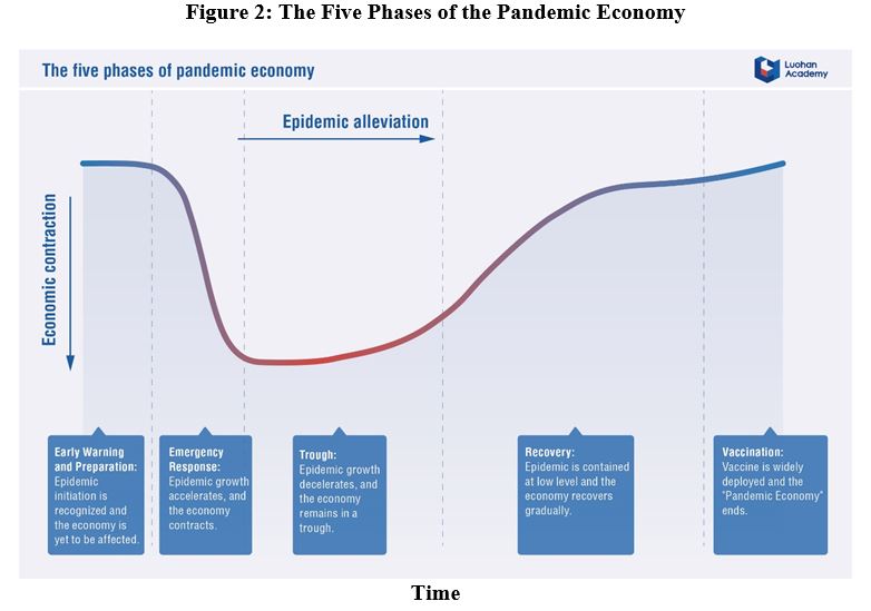
Generally speaking, a sharp and deep contraction is followed by a period (of variable duration) in which the economy remains depressed as the virus is brought under control (the trough). This phase is then followed by an S-shaped recovery – a slow but steady acceleration in growth, followed by a deceleration as output approaches its pre-pandemic levels. This last deceleration reflects the fact that some sectors (air travel, sporting events) are difficult to restore, given the continued need for social distancing.
The main economic challenge lies in shortening the free-fall phase through early detection and containment (a challenge that most countries have failed to meet). Then the goal is to reduce the time spent in the trough while also making satisfactory progress on containing the virus. Eventually, the economy will decouple from the outbreak as new infections subside.
An effective, widely deployed vaccine would, of course, accelerate the recovery, even allowing for a U-shaped recovery if it arrived soon enough. As matters stand, that scenario seems unlikely.
To balance virus containment with support for the economic recovery, policymakers need better tools to measure and monitor the evolution of the global pandemic economy. With this goal in mind, Luohan Academy recently launched a Global Pandemic-Economic Tracker (PET), which aims to provide government leaders, businesses, and the general public with a deeper understanding of the general patterns of the pandemic economy’s processes, the tradeoffs that occur at different stages, and other challenges that await.
Charting the Pandemic Economy
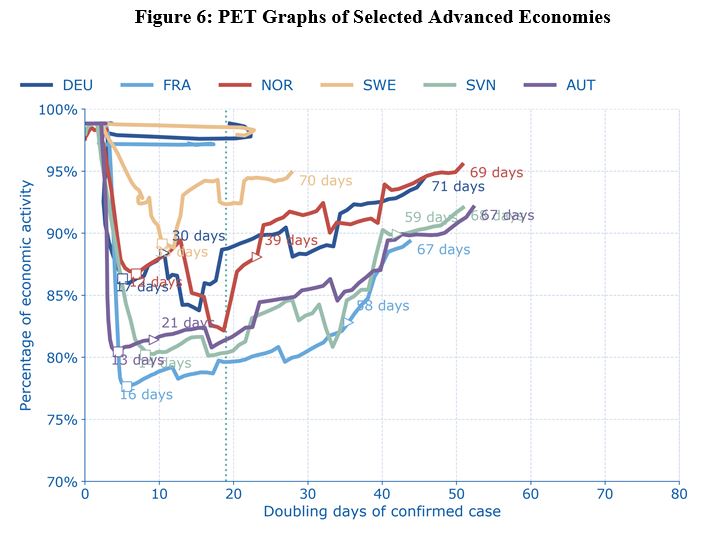
The PET offers a window into a wide range of economies. In the graphs below, the vertical axes show the magnitude of the contraction, the estimated current levels of economic activity as a percentage of pre-pandemic levels, according to daily mobility data. The horizontal axes follow the number of days it takes for confirmed infection cases to double, as of the time of measurement. Doubling days (DD) is a proxy for the rate at which the virus is spreading within the population; the larger the DD, the lower the rate of spread.
Each graph also has a dashed vertical line showing the average DD for economies that have already met our recovery condition: 19 days. When an economy has gone three consecutive days in which the number of COVID-19 recoveries exceeds the number of confirmed new cases, we take that to mean that the outbreak has been met with an effective medical response. Thus, a country to the left of the dashed vertical line is less likely, on average, to have the virus under control, regardless of what is happening in its economy.
The time dimension in the graphs is also important to grasp, because the economic damage in terms of lost income, output, and increased unemployment depends on both the depth of the contraction and its duration. If the PET graphs for two countries look similar but the speed of transition is higher for one, that country will be in better shape. It will have experienced less balance-sheet damage; its programs to buffer the shock will be shorter-lived and less costly; and its deficits and sovereign debt increments will be lower.
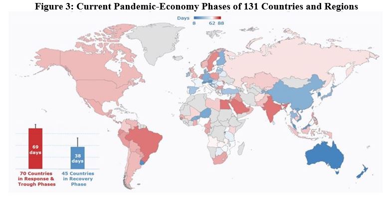
As of May 20, at least 45 countries and regions had entered the recovery period, though most are still far from restoring normal economic activities. More than half of the countries analyzed still have not entered the recovery period after suffering the pandemic for more than two months.
The First Wave
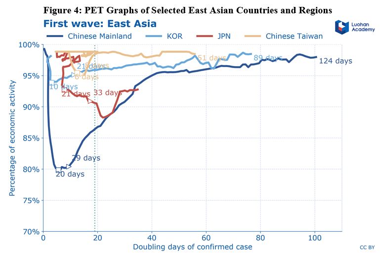
The first wave of the pandemic hit mostly East Asian countries, with China’s trajectory representing the pandemic-economy curve very well. It took China 30 days to reach the bottom, at about 80% of normal economic activity, and this rapid lockdown more or less paid off.
By May 20, China had been in the pandemic economy for 124 days, during which time its DD steadily increased. Its economic activity has returned to 98% of its pre-pandemic level, and quarterly economic growth is on track to be positive in April-June. With strong stimulus packages, China should continue to register positive growth in the second half of the year. Note, however, that strong growth does not necessarily imply full recovery.
Several other East Asian countries and regions performed even better, owing to their early-detection regimes and other swift policy actions. South Korea, Hong Kong, and Taiwan have all recovered to more than 95% of normal activity levels. Their contractions at the start were less severe, and their DDs have all exceeded 50 days (meaning it takes more than seven weeks for the number of infections to double).
Overall, the lesson from East Asia (Figure 4) is that the faster and more decisively a country moves to contain the virus in the early stages, the smaller a price it has to pay, in terms of both public health and economic loss. Counterfactual models applied to other countries such as the United States reach the same conclusion.
Choppier Waters
Unfortunately, second-wave countries learned this lesson the hard way (Figure 5). Italy, for example, has been in the pandemic economy for 85 days. It took 62 days to satisfy our proxy recovery condition, and it has remained in a deep contraction for most of the 85-day period. Spain’s experience has been similar.
The US economy has been contracting for 65 days and has not satisfied the recovery condition. If it continues at just over 90% of normal economic activity through the second quarter, quarterly GDP growth will be close to -10%, with the economy shrinking by 34% on an annualized growth, on par with the Congressional Budget Office’s prediction of -38% annualized growth. In other words, the US is heading for a situation comparable to the Great Depression, when the annual growth rate bottomed out at -12.9%.
The United Kingdom is in a very similar situation, but has experienced a deeper estimated contraction. By contrast, Australia and New Zealand have both passed the 50-day DD threshold. New Zealand, in particular, presents an interesting case. Though its government got the virus under control relatively quickly, its estimated contraction was large – comparable to Italy and Spain. The difference, of course, is that since it has the virus under control, it is well positioned for a faster recovery.
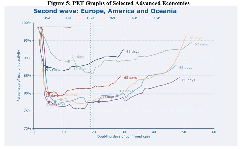
For their part, Germany, France, Austria, and Sweden have all remained in contraction mode for 67-71 days. But while Germany and France have gone through similar pandemic-economy trajectories, Germany’s economic activity contracted less.
Sweden’s economic activity also contracted less than some of the others, but that was because it deliberately chose a looser lockdown. Like the US and the UK, it has not satisfied our proxy recovery condition. Norway, on the other hand, initially suffered a deeper contraction than Sweden, but is now much further along in terms of its DD, and has experienced a return of economic activity to levels above Sweden’s. Austria, finally, has fared pretty well, exceeding the threshold of 50 DD.
The Coming Storm
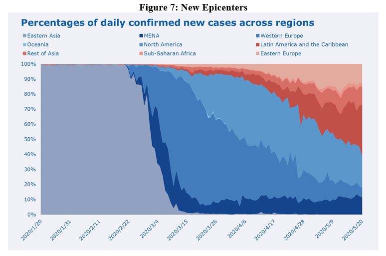
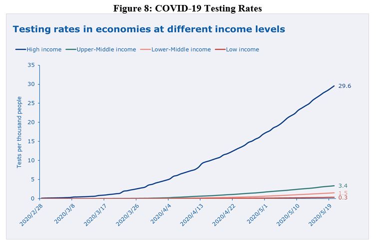
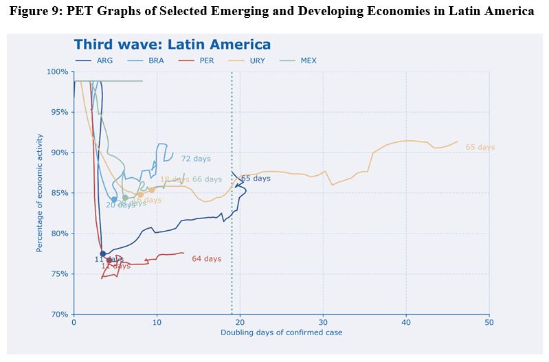
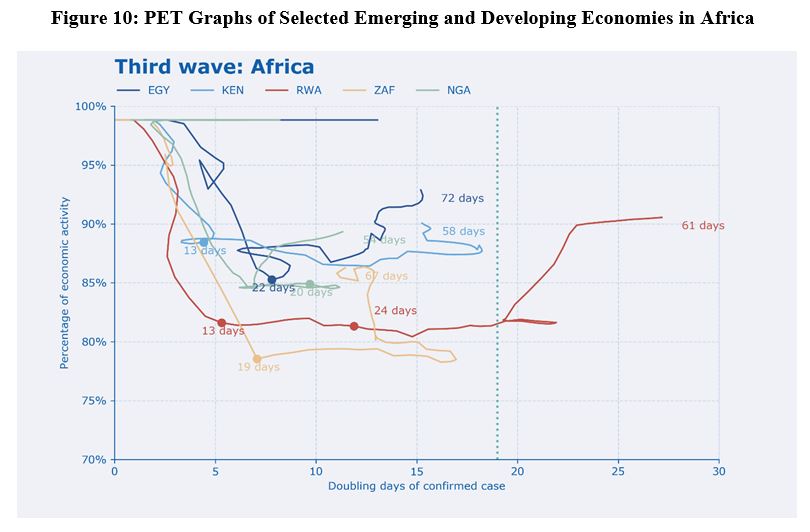
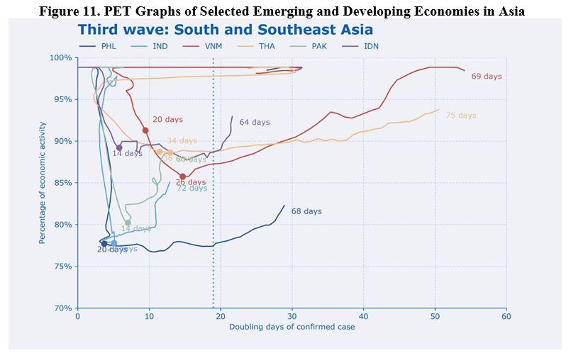
The third-wave countries have been hit harder. Since early May, the developing world is becoming the new pandemic epicenter. More than half of daily new cases are now reported from these countries and regions (Figure 7), where public-health systems, medical supplies and production capacity, and economic-policy buffers are weaker than in the advanced economies. Making matters worse, these countries’ ability to test at the needed scale is woefully lacking (Figure 8).
In Latin America, Brazil stands out for having remained to the left of the dashed vertical line for 72 days; its DD is still around only ten. The fact that its curve is squeezed on the left side indicates that it has not found an effective way to combat the outbreak or support an economic recovery.
Brazil’s contraction was smaller than some others we have seen, but with the virus still out of control, its prospects are bleak. Mexico is in a similar situation. By contrast, Uruguay has had a much better experience than most of its South American neighbors, with a much higher DD, paving the way for a sustainable recovery.
In Africa, Rwanda has fared better than many countries, though it has not yet reached the 30-DD threshold. The trajectories for Egypt, Kenya, and Nigeria, meanwhile, have been stuck on the left of the graph, sometimes even going backward, which suggests that they are having difficulties balancing virus control and economic recovery.
As for the rest of the Asian countries, both Vietnam and Thailand have made good progress, with DDs exceeding 50 days and their economies recovering to close to or more than 95%. In contrast, the Philippines’ economic activity has contracted much more and is still lower than 85% after 68 days.
The situation in India and Pakistan – high-density countries where large parts of the population live on limited resources – is of significant concern. These countries have long been stuck on the left side of the graph, indicating that the virus is not under control. Like Brazil, their DDs are fixed at around ten days. Their curves are going upward, suggesting modest economic rebounds that will remain vulnerable to the virus. At some point, they may be forced to restart their economies before the virus has been brought under control, owing to the mounting human and economic costs of the lockdown.
The Road Ahead
Like the recovery more broadly, the pandemic tracking project is a work in progress. Luohan Academy intends to update the data daily, in order to provide real-time information to policymakers, researchers, and think tanks, and it is inviting everyone to join in co-creating more data products. (It is also welcoming comments and suggestions on how to improve its current work.)
While a few countries detected and contained the virus early, allowing for more moderate contractions and a relatively rapid recovery, no country has been spared. The majority of higher-income countries in which the virus spread widely before there was a response have experienced deep and lengthy economic contractions. These downturns have varied in degree, but in all cases the speed of the recovery has been moderate to slow.
Meanwhile, a variety of middle- and lower-income countries have begun to display even more worrying patterns. This third wave has featured large and lengthy economic contractions and limited success in controlling the virus (with a few notable exceptions).
Looking ahead, the worst outcome would be a large contraction followed by an extended period with little or no movement either upward (the economy) or rightward (virus control). In a few of the cases mentioned above, a limited economic recovery appears to be starting without movement to the right. Though it is too soon to forecast these cases precisely, a constrained economic recovery in the context of a largely uncontrolled outbreak seems likely. Hospitals and somewhat fragile health-care systems may end up overwhelmed, as they were in the early days in several advanced countries and sub-regions.
More generally, these tracking data and graphs emphatically confirm the need for the international community to come together to provide large-scale support to mostly lower-income countries in both dimensions of the battle: containing the virus and restoring the economy. In the pandemic economy, both axes are critical to recovery.