Mapping Capital Flows Into the U.S. Over the Last Thirty Years
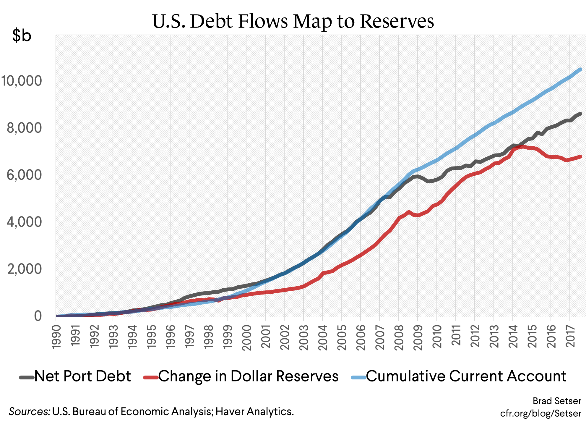
Up until 2014, the growth in central bank dollar reserves closely mapped to the increase in U.S. net external debt. The past few years have been different: for the first time in a long time, yield-starved private investors in Europe and Japan, not emerging market reserve managers, financed the United States’ external deficit.

I recently had the opportunity to attend a conference organized by the Central Bank of Ireland on, fittingly enough, financial globalization.
The conference, held in honor of the Central Bank of Ireland’s 75th Anniversary, prompted me to do something I had wanted to do for a while: put in the elbow grease needed to try to integrate the financial side of the new U.S. balance of payments statistics with the old U.S. balance of payments statistics.
The new statistics have the advantage of global consistency. The old statistics had the advantage of doing a better job of highlighting the impact of the rest of the world’s demand for reserves on the U.S. balance of payments. And as part of trying to link the two data series up, I also wanted to take a fresh look at how well the U.S. data—old, and new—has captured the full impact of central bank demand for reserves.
That suddenly feels important again. Historically, central banks have tended to add to their reserves—and buy Treasuries—when the dollar is weak, not when the dollar is strong. And with the dollar’s fall in January and the massive increase in Treasury issuance now planned, the scale of the reserve manager bid for Treasuries has once again become market relevant.
One thing emerged quite strongly from this analysis.
The dollar’s appreciation in 2014 coincided with a rather fundamental shift in how the ongoing U.S. current account deficit has been financed—a shift that in some ways was as big as the shift associated with the global crisis.
The reasons for why 2014 led to such a large shift in the composition of global demand for U.S. financial assets should be fairly obvious.
- The price of oil fell below most countries breakeven price, so the oil exporters stopped adding to their reserves, and many started selling.
- And the dollar’s appreciation against the “majors” prompted China’s 2015 decision to “reform” its exchange rate regime (and in the process allow a bit of yuan depreciation against both the dollar and the basket) led to significant outflows from China and—briefly—pressure on almost all Asian currencies to depreciate.
For the first time in a long time global reserves fell.
That’s important. The easiest way to see the change in the composition of financing to the U.S. is too look at the data on outflows from the external creditors of the U.S., rather than looking directly at the U.S. data.
What do I mean by that?
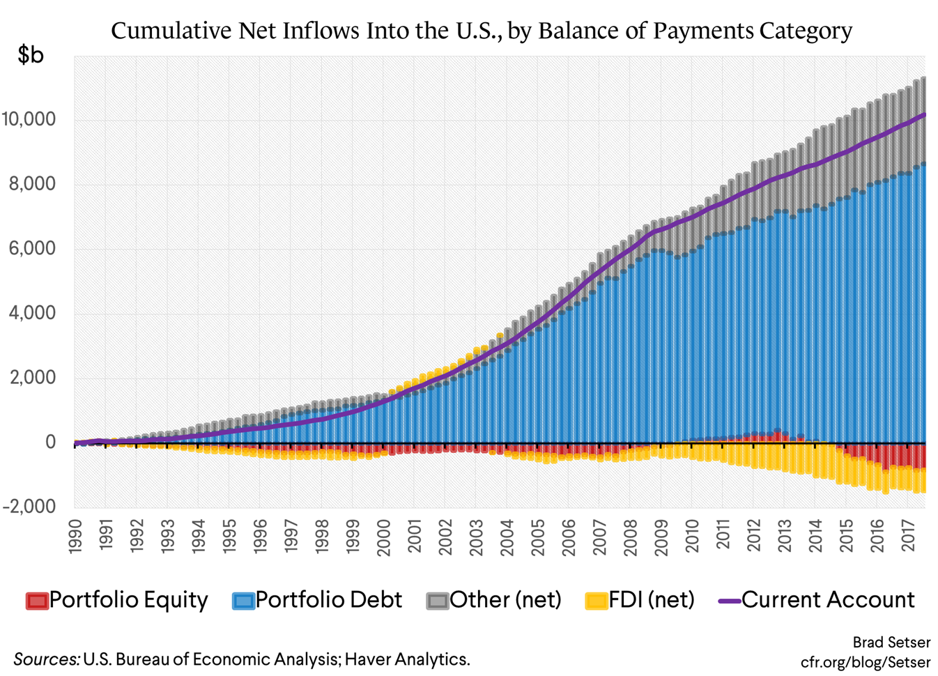
If you do a simple first cut of the U.S. balance of payments nothing much seemed to change in 2014.
In 2013, the net inflow needed to finance the U.S. current account came (largely) through the sale of long-term portfolio debt to the rest of the world. And in 2015, the new inflow needed to finance the U.S. current account also came from the sale of long-term debt to the rest of the world. And the amount of debt the rest of the world needed to buy didn’t change much either—the current account deficit was roughly the same size in 2013 and 2015.
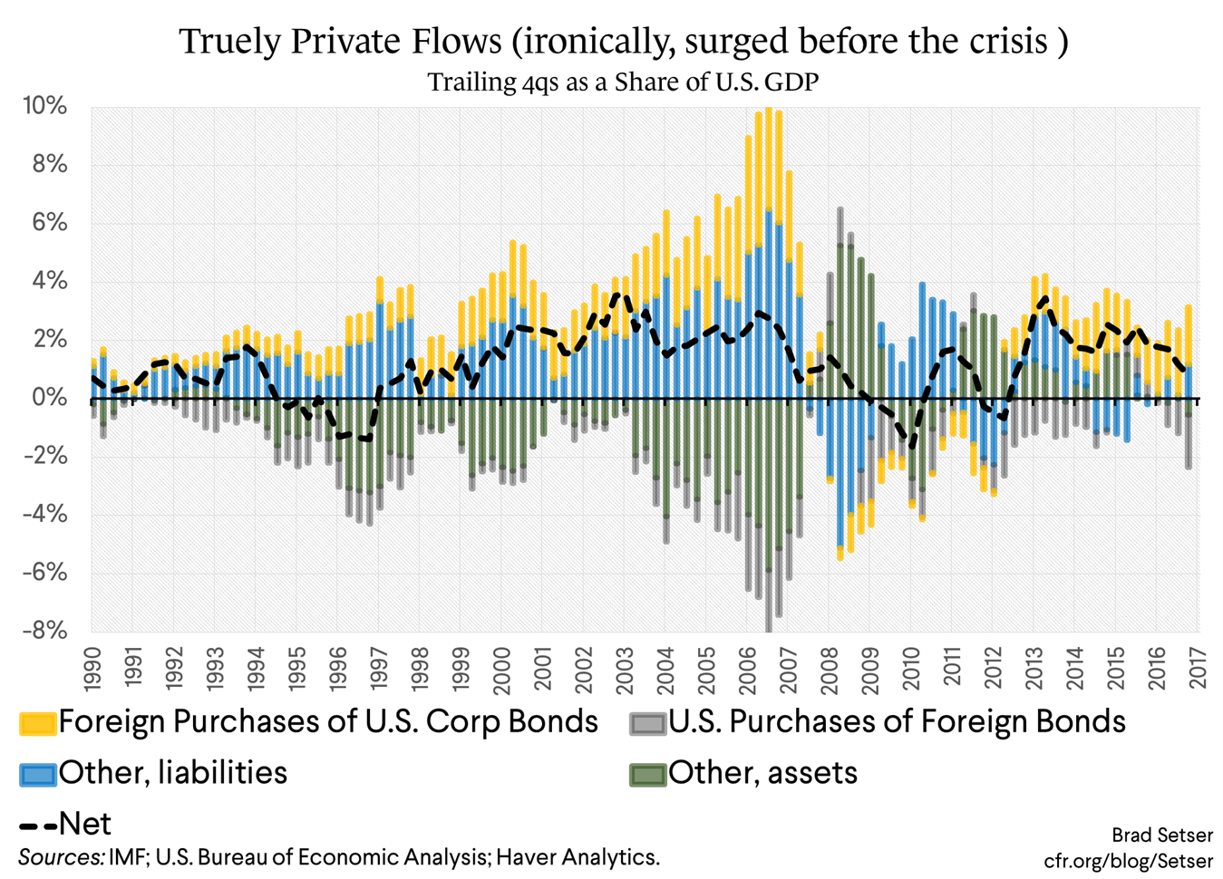
A plot, for example, of cumulative net foreign purchases of U.S. debt against the cumulative current account deficit doesn’t suggest a break in 2014. In dollar terms, the United States net external debt continued its steady march up, though at a pace that has limited the rise in external debt-to-GDP after the global crisis. And the bulk of the needed inflow has come through foreign purchases of U.S. bonds (“portfolio inflows, debt in the balance of payments”). (After the crisis, the U.S. also has gotten a bit more net financing through bank, or “other” flows after the global crisis than it did before).
That though is a bit misleading. For most of the past 25 years, net foreign demand for long-term U.S. debt securities has increased in line with the growth in global dollar reserves.*
That could be a coincidence, but I don’t think so.
And in 2015 global reserves fell.
The implication, of course, is that the composition of the creditors financing of the U.S. external deficit changed even though the overall deficit did not.
Rather than selling bonds to the central banks of China, Japan, Taiwan, Korea, Thailand, and Switzerland—and the monetary agency of Saudi Arabia, the various reserve and sovereign funds of Singapore, and the world’s main oil exporters—the U.S. external deficit has been financed through the sale of Agency and corporate bonds to large institutional investors in Europe and East Asia (with a proviso that in many Asian countries, government run pension funds have become important sources of demand). To put it a bit too bluntly, life insurers and pensions funds reaching for yield in a world of QE in Europe and tight fiscal policy in a host of surplus economies (Taiwanese and Korean life insurers have to do more than just buy the bonds issued by their own government) displaced the State Administration of Foreign Exchange as the key buyers of U.S. government bonds.
Two quick side points.
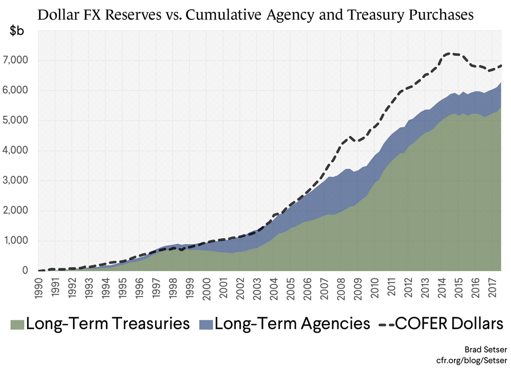
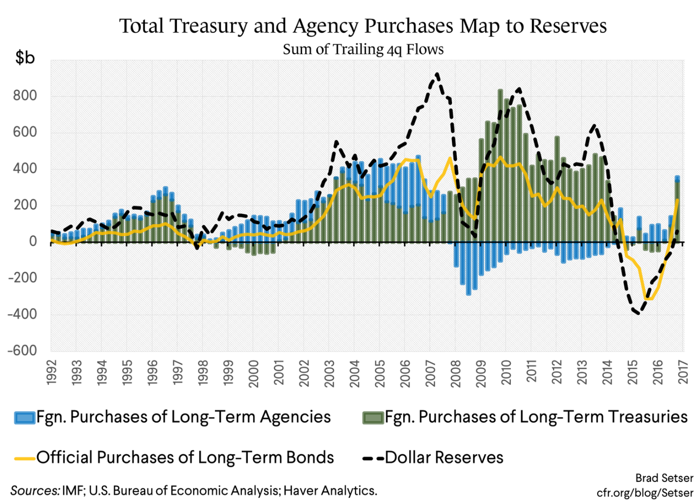
First, the “fit’ between the increase in global dollar reserves and total foreign purchases of Treasuries and Agencies is remarkably good. And the fit is actually better if you sum up all foreign purchases of Treasuries and Agencies, not just the recorded official purchases. Basically, to the first order of approximation, all net foreign demand for “safe” US assets from 1990 to 2014 came from the world’s central banks (read the footnote for needed caveats).**
This is particularly true from say 2003 to early 2013—Gagnon and Bergsten’s “decade of manipulation.”***
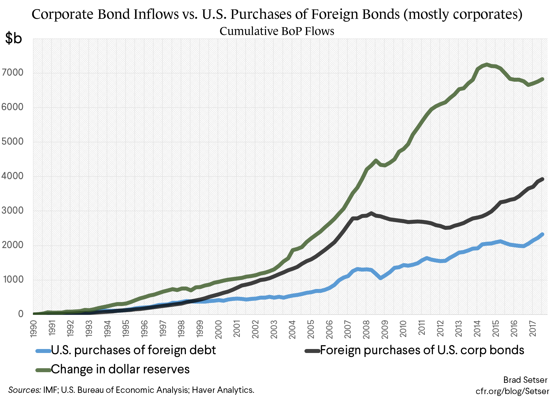
Second, there have been significant corporate bond inflows into the U.S. during this period—particularly in the years preceding the global crisis. But we now know that those pre-crisis inflows often came from the offshore dollar balance sheets of the large European banks. And they funded those purchases in part by selling short-term commercial paper back to American investors—it really was round tripping. The recent surge seems a bit different—though some fraction of it no doubt reflects investments of the funds that the big U.S. multinationals accumulated offshore as a result of their desire to defer tax on their global profits.****
There are a couple of other ways to get at the shift in the composition of demand for U.S. bonds in the past few years.
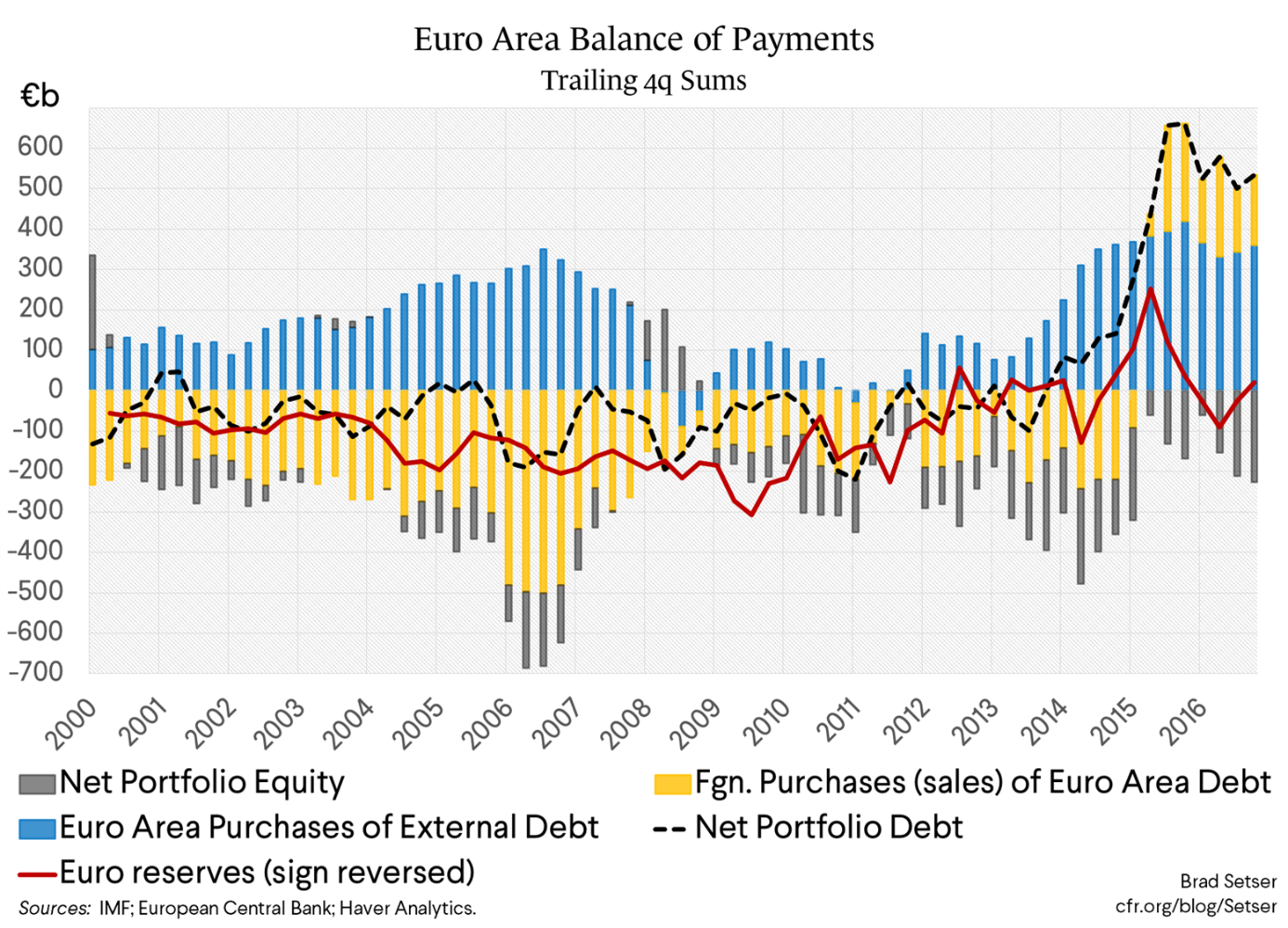
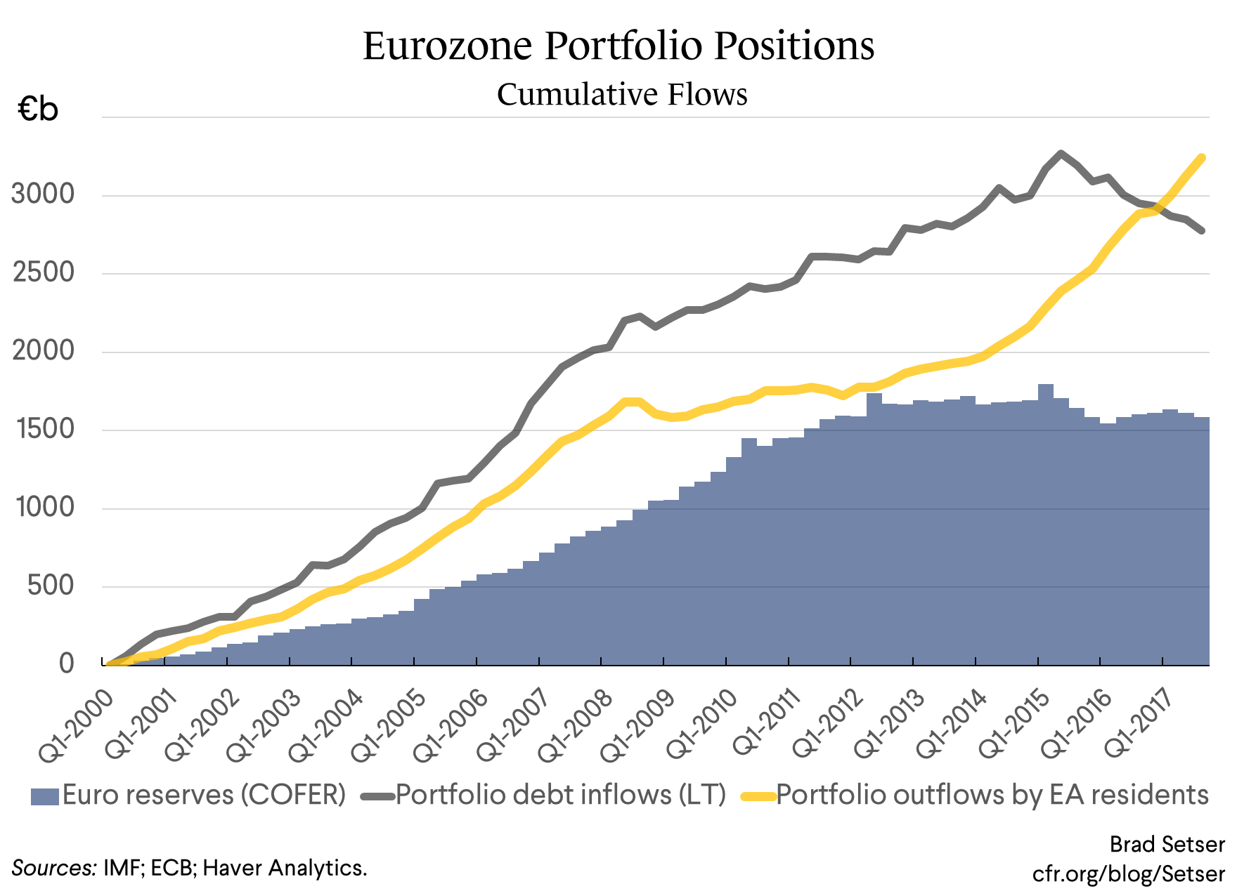
The most obvious is to look at the European data—European purchases of foreign bonds have surged, and now far exceed what could be plausibly attributed to the offshore activities of U.S. firms that have found tax homes in Europe. The recent counterpart to the eurozone’s large surplus has been very large portfolio debt outflows (which also is a bit of a change).
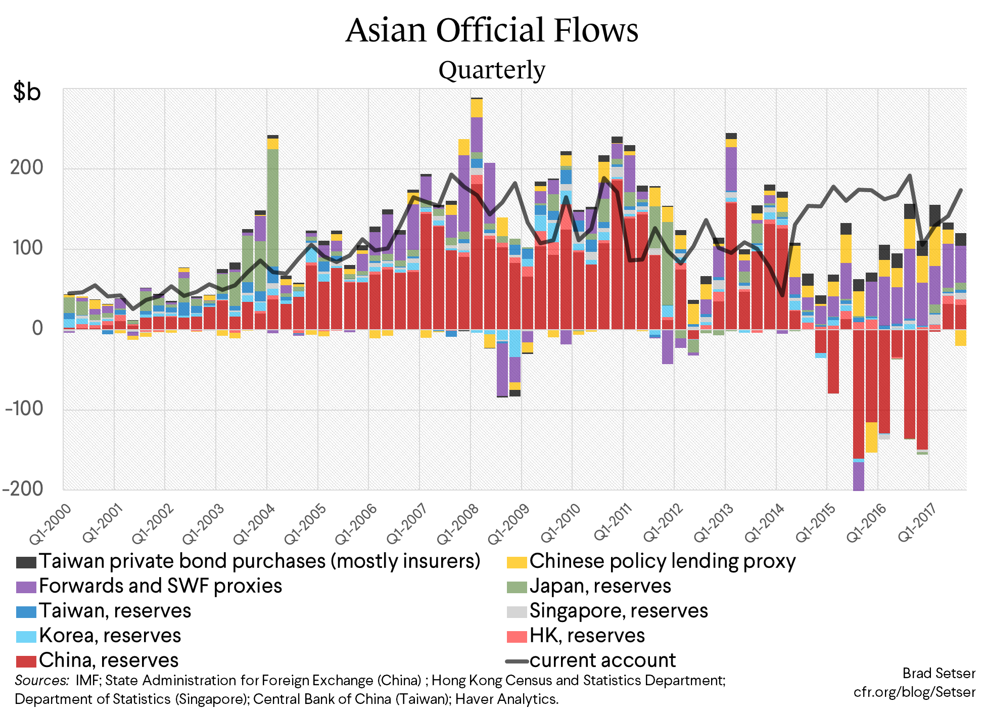
The less obvious way is to look at the growth of Asian reserves relative to Asia’s current account surplus. From 2000 until early 2014, the rise in Asian reserves (all foreign exchange reserves, not just dollar reserves—this is the sum of flows in the balance of payments) matches Asia’s accumulated external surplus nearly dollar for dollar.
That is even more true if you add in the rise in forward book of the main Asian central banks, and (estimated) sovereign wealth and pension fund outflows.*****
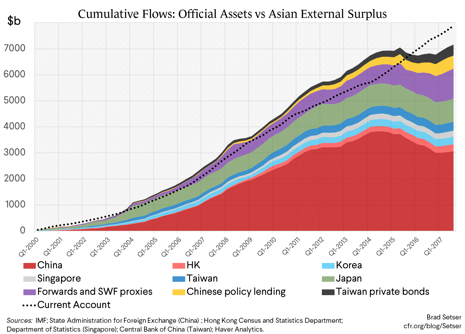
The correlation though breaks down in 2015 and 2016.
In other words, there were a couple of years when the net outflow from Asia associated with Asia’s current account surplus was really private.
A closer look at the numbers though suggests that changes are already afoot. We only have three quarters of data available for 2017, but if you look closely, Asia’s reserve and shadow reserves are clearly rising again.
And if you add in the lending of China’s policy banks and one large source of private outflows—Taiwan’s life insurers—the growth of official assets now tracks the current account surplus. I am being a bit unfair by including the Taiwanese life insurers along with the official flows, but, I fear, only a bit. Prudential regulation on the life insurers’ foreign currency exposure have been lifted over time to encourage this outflow.
Why does all this matter?
Simple: my thesis, more or less, is that it took a rather extraordinary set of circumstances to generate three years of private funding for the U.S. external deficit. And it isn’t clear if those circumstances will persist.
The ECB is buying fewer bonds these days, and may stop altogether later this year.
China’s peg (now to a basket) isn’t under pressure (technically, China is adding to its reserves not selling them—the 2017 balance of payments shows net purchases of close to $90 billion). And the fall in pressure on China has had knock-on effects on Thailand, Singapore, Korea, and Taiwan.
That at least is the lens I use to interpret the dollar’s recent weakness.
And it is also the lens I use to interpret Asia’s return to intervention to cap Asian appreciation—and to support Asia’s exports and its trade surplus—in January.
There is a bit of pressure in the market, I think, to move some ways back to the “old” flow equilibrium, one where central banks, not private investors, fund much of the United States trade deficit.
But it isn’t yet entirely clear if that is a politically acceptable equilibrium in the Trump era.
P.S. I have left the oil exporters out of this story because they no longer have that big of a current account surplus, and thus the global flow equilibrium can be simplified by focusing on the U.S (and the UK), the main European surplus countries (proxied by the eurozone), and the key East Asian surplus economies. Historically, the oil exporters’ surplus has had one important similarity to that of Asia: the surplus largely financed a buildup in the central bank reserves and sovereign wealth funds of a few key countries.
A general note on methodology. I looked at flows over time in two ways: first, by taking a trailing four quarter sum (standard) using the BEA’s quarterly flow data, and second, by summing up the flows over time to calculate an implied stock. Summing flows to estimate stocks abstracts away from valuation changes. The BEA adjusts its flow data over time to match the survey data (and to account for principal repayment on Agency MBS). The BEA data thus has significant advantages over the raw TIC flow data.
* I assumed that the dollar share of countries that do not report detailed data on the currency composition of their reserves to IMF matches the dollar share of those that do. Historically China has been the most important country that does not report. However, over the last few years, its reserves have been (slowly) incorporated into the overall numbers, and as a result the IMF’s detailed data covers something like 85 percent of total reserves now. The (still partial) incorporation of China’s reserves into the data hasn’t resulted in big jumps in the dollar’s reported share. That suggests that the dollar share in China’s reserves were reasonably close to the global norm. My own work reached a similar conclusion using the U.S. custodial data.
** The words “to the first approximation” are important. Some central banks clearly did diversify away from safe but low-yielding Treasuries and put a portion of their dollar reserves into riskier assets. We know, for example, that some big reserve managers own a few U.S. equities (see the technical details of the TIC data release, the custodial data shows significant official holdings of equity). We also know private investors abroad—notably the legally “offshore” corporate treasuries managing the “offshore” profits of U.S. firms—have bought a few Treasuries. These flows though seem to largely offset.
*** There is one exception—in 2007 and 2008, when sovereign wealth funds were the craze—foreign purchases of Treasuries and Agencies lagged estimated dollar reserve growth. The missing funds were either put on deposit at the world’s banks (the yield curve then was flattish), invested in riskier U.S. assets, or diversified into other currencies. Remember dollar reserves are an estimate—there isn’t hard data on what countries that historically have not reported to the IMF did during this period. China obviously has been the most important non-reporter, and the evidence is reasonably good that SAFE did take on more currency and equity risk during this period.
**** The tech companies have issued a non-trivial sum of bonds to fund dividend payments and the like, essentially borrowing onshore to avoid legally moving their offshore funds home and incurring the associated tax liability (under the old cash law). So Apple can use its offshore cash to buy google’s bonds, and Oracle and others can use their offshore cash to buy Apple’s bonds and so on …
***** I used government portfolio assets as the proxy for sovereign wealth and sovereign pension fund assets. China doesn’t provide a breakdown by sector, so I assumed all portfolio outflows are from the state banks and government funds. We know that is the case for most portfolio debt (hint: the state commercial banks reported holdings of foreign currency denominated bonds rose in parallel), and the timing of the portfolio equity outflows suggests that a significant portion came from the China Investment Corporation (CIC). When China publishes more complete balance of payments data, I will adjust this number if necessary.